

AI智能摘要·AI
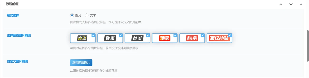
本文介绍了一个CSS动画效果:为文章标签前缀(`.DearLicy_prefix`)添加了斜切边角样式,并通过 `::after` 伪元素实现从左到右循环扫过的光泽动画(`sweepTitle`),使用 `linear-gradient` 渐变和 `transform` 旋转营造闪光效果,适用于子比等主题的文章前缀美化。
.DearLicy_prefix{
    position: relative;
    overflow: hidden;
    display: inline-flex;
    align-items: center;
    border-radius: 5px;
    padding: 5px 4px;
    margin-right: 3px;
    height: 19px;
    font-size: 12px;
    top: -3px;
    clip-path: polygon(7% 0, 99% 0, 93% 100%, 0 100%);
}
.DearLicy_prefix:after, .DearLicy_prefix:after {
    position: absolute;
    content: " ";
    display: block;
    left: -100%;
    top: -5px;
    width: 15px;
    height: 145%;
    background-image: linear-gradient(90deg, rgba(255, 255, 255, 0), rgba(255, 255, 255, 0.5), rgba(255, 255, 255, 0));
    animation: sweepTitle 3s ease-in-out infinite;
    transform: rotate(28deg);
}
@keyframes sweepTitle {
    0% {
        left: -100%
    }

    100% {
        left: 100%
    }
}© 版权声明
THE END
喜欢就支持一下吧


相关推荐


暂无评论内容